

SMM Panel Website Design: Pages That Build Trust
Visitors decide in seconds whether your panel looks safe enough to deposit money. This chapter covers the design choices, page sections and dashboard details that turn visitors into paying customers.
In this chapter
- What an SMM panel website actually needs to do
- How to choose a ready design and adapt it to your brand
- Homepage sections that convert, in a recommended order
- Building a services page with transparent pricing
- Trust elements that work without fake claims
- Multi-language, mobile and speed
- Designing the customer dashboard, where repeat orders happen
What your website has to do
An SMM panel website is not a portfolio. It has three jobs, in this order:
- Explain in one glance what you sell and for which platforms.
- Make a visitor trust you enough to create an account and make a first deposit.
- Make ordering fast for returning customers, who bring most of your revenue.
Everything on the site should serve one of those jobs. Animations, long brand stories and stock photos that do not help a buyer decide are noise. Keep that test in mind for every section you add.
The site has two faces: the public storefront (home, services, API, blog, extra pages) that new visitors see, and the customer dashboard (new order, orders, add funds, support) that logged-in customers use every day. Most owners spend all their effort on the first and forget the second.
Choosing a design
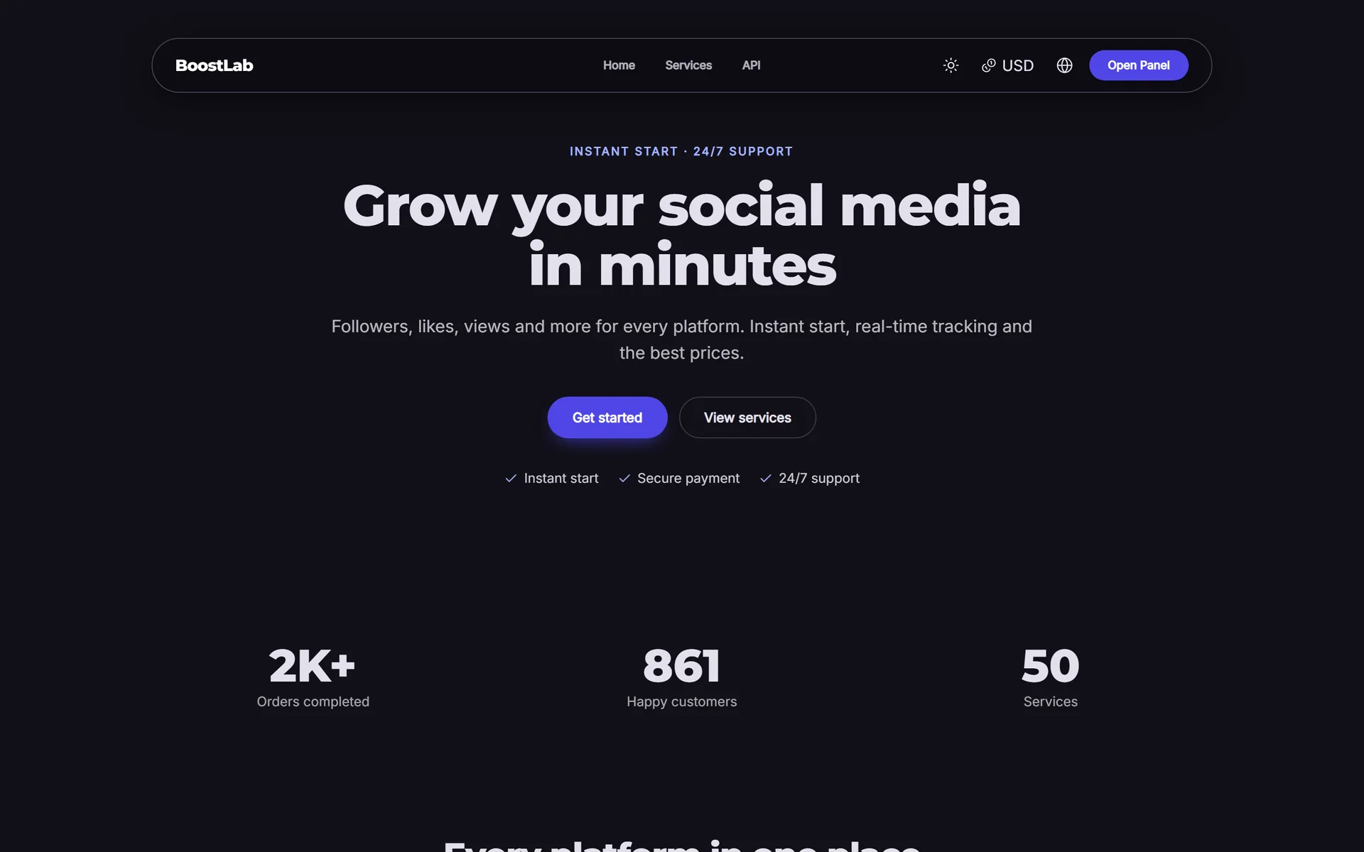
Start from a ready design
Building a site from a blank page is slow and rarely better than a tested layout. SMMFor includes 20 ready designs (18 on Pro, all 20 on Business), from calm corporate looks to dark neon styles, a dense table-heavy style for resellers and designs with an order form directly on the homepage. You can browse them with live demos in the design gallery.
Pick a design based on your audience, not your personal taste:
| Your main audience | Design character that fits |
|---|---|
| First-time buyers, influencers | Bright, friendly, clear steps, quick order form on the home page |
| Resellers and agencies | Dense, table-focused, fast navigation, API visible in the menu |
| Premium or high-ticket buyers | Calm, spacious, dark or neutral with restrained colour |
| Young social audience | Vivid gradients, rounded shapes, playful but readable |
Make it yours without breaking it
A design sets layout and character; your brand sets colour, logo and voice. Good customisation keeps the structure and changes:
- Main colour: one strong brand colour for buttons and links. Check that text on buttons stays readable.
- Logo and favicon: simple, readable at small sizes. See the name and domain chapter.
- Fonts: one or two at most.
- Light and dark mode: decide which mode opens by default for your audience.
Avoid rebuilding every section from scratch in the first week. Launch with a good design, then improve the sections your analytics say matter.
Homepage sections that convert
A recommended order
A homepage that works for SMM panels usually follows this structure. With a block page builder you can add, reorder or hide each section.
- Hero: a short headline that says what you sell, a one-line subheading, and two buttons (Sign up, View services). Optionally a quick order form or sign-in box.
- Platforms strip: icons or names of the platforms you serve (Instagram, TikTok, YouTube, Telegram...). Visitors confirm in a second that you cover their platform.
- How it works: three steps, such as "Create an account, add funds, place your order".
- Popular services or packages: four to eight best sellers with starting prices.
- Why us: three or four concrete points (support hours, refill policy, payment methods, API for resellers).
- Payment methods: logos or names of the methods you accept.
- FAQ: six to ten real questions from your support tickets.
- Final call to action: one clear button to sign up.
Writing the hero
The hero headline should name the result and the audience. Compare:
- Weak: "The best SMM panel in the world"
- Better: "Followers, likes and views for Instagram, TikTok and YouTube, from $0.10"
- Better for resellers: "Wholesale SMM services with API, refill and fast support"
Only show a starting price if it is accurate and the service is actually available. A "from" price that leads to a disabled service damages trust immediately.
Sections to skip
- Fake live order counters or invented "orders delivered" numbers
- Testimonials you wrote yourself
- Long paragraphs of keyword-stuffed text above the fold
- Autoplay video with sound
If you want SEO text on the homepage, put it lower on the page under a clear heading. The SEO chapter explains how to do that without hurting conversions.
The services page
Make the full list public
Many buyers want to see services and prices before they sign up. A public services page with search and category filters answers that and also gives search engines real content to index. Show for each service:
- Service ID (resellers use it)
- Name, following the naming formula from the catalog chapter
- Price per 1,000
- Min and max
- Average time or start time, if you track it
- A short description or a details link
Pricing transparency
Transparent pricing is one of the strongest trust signals an SMM panel has. Practical rules:
- Show prices per 1,000 consistently. Do not mix per-100 and per-1,000.
- Show prices in the visitor's currency where possible. With multi-currency display, customers can browse in their own currency while you keep one base currency.
- Mention fees honestly. If a payment method adds a fee, say so on the Add Funds page, not after payment.
- Do not hide minimum deposits. State them next to each method.
- Explain refill and cancel in plain words on the services page or a linked policy.
Tip: a short "What does refill mean?" box on the services page prevents more tickets than any FAQ page, because it sits exactly where the question comes up.
Trust elements that work
New visitors are sending money to a site they found minutes ago. Give them honest reasons to trust you:
- A custom domain with HTTPS. A free subdomain is fine for testing, but your own domain looks more established. On SMMFor custom domains come with SSL included.
- Clear contact options: a ticket system, a support email and a messaging channel such as Telegram, with real response hours.
- Policies that exist and match reality: terms of service, refund policy and privacy policy, linked in the footer. See the legal chapter.
- Recognisable payment methods displayed before signup.
- An API page, which signals to resellers that you are a serious panel.
- A blog with useful articles, updated occasionally, which shows the business is active.
- Consistency: the same name, logo and colours on the site, in emails and on your Telegram channel.
What does not build trust: fake reviews, stock photos of "our team", invented statistics and guarantees like "100% safe". Social platforms may restrict bought engagement, and savvy buyers know it. Being honest about limits makes the rest of your claims believable.
Extra pages worth adding
Beyond the homepage and services, a few extra pages pay off:
| Page | Purpose |
|---|---|
| API documentation | Lets resellers connect quickly; see the API chapter |
| FAQ | Answers top support questions |
| Terms, refund, privacy | Required for trust and for payment gateways |
| Platform pages (for example "Instagram services") | Landing pages for search traffic |
| Blog | Guides that attract and educate buyers |
| Contact or support | Clear way to reach you |
Many payment gateways review your website before approving your account. Having terms, refund and contact pages live before you apply speeds that up.
Multi-language storefront
If you sell to more than one country, a storefront in the visitor's language increases trust and conversions noticeably. SMMFor storefronts support multiple languages, and every text can be edited per language.
Do it well:
- Translate properly. Machine translation without review reads as careless, especially on payment and policy pages.
- Localise, not just translate. Payment methods, examples and currency should fit each market.
- Start with two languages, your main market's language and English, then add more only when you see traffic from those countries.
- Keep service names consistent across languages, so support can refer to services by ID and name without confusion.
Mobile first
A large share of SMM buyers browse and order on their phones, often coming from a social app. Test your site on a real phone, not just a resized browser window:
- Can you sign up with one thumb?
- Is the new order form usable without zooming?
- Do long service names wrap cleanly?
- Are payment buttons large enough?
- Does the menu collapse into something obvious?
SMMFor panels can also be installed as a mobile PWA, which lets regular customers open your panel from their home screen like an app. Mention it to repeat customers; it reduces the steps to the next order.
The customer dashboard experience
Where repeat revenue happens
Returning customers rarely see your homepage again. They log in and go straight to New Order. That screen deserves as much attention as the hero:
- Category and service selectors that are fast and searchable
- Service description visible next to the form, so customers see refill, speed and link format before ordering
- Live price calculation as the quantity changes
- Clear balance display with an Add Funds button nearby
- Mass order for resellers who place many orders at once
- Order history with clear statuses and refill or cancel buttons where available
Dashboard look and feel
SMMFor offers customer dashboard themes that change the layout of the logged-in area, while colours and fonts come from your panel's main design, so the storefront and dashboard feel like one product. Choose a dense layout if your customers are resellers, and a more spacious one if they are first-time buyers.
Announcements and onboarding
Use a short announcement area in the dashboard for new services, price changes or holiday support hours. Keep it to one or two lines; long notices get ignored. For brand-new customers, a small "first order" hint (pick a category, paste the link, add funds) reduces early tickets.
Speed and performance
A slow panel feels unreliable, and slow pages also rank worse in search. Keep it fast:
- Compress images and avoid heavy background videos.
- Limit third-party scripts. Every chat widget, tracker and font adds load time.
- Keep the services page usable with large catalogs by using categories and search instead of one enormous list.
- Test on a mobile connection, not just office Wi-Fi.
Hosted platforms handle server-side speed for you; your part is not undoing it with heavy custom code.
Warning: custom scripts and tracking codes run on every page, including payment pages. Only add code from sources you trust, and remove what you no longer use.
Common design mistakes
- Choosing a design for personal taste instead of the audience.
- Hiding prices until after signup.
- No policies or contact page.
- Fake reviews, counters or guarantees.
- Ignoring the mobile order form.
- Forgetting the customer dashboard.
- Launching in five languages with poor translations.
- Adding so many scripts that the site becomes slow.
Storefront launch checklist
- Ready design chosen for your audience, brand colour and logo applied
- Hero states what you sell and for which platforms
- Homepage sections in a clear order with one main call to action
- Public services page with prices per 1,000, min/max and IDs
- Payment methods and fees visible
- Terms, refund, privacy and contact pages linked in the footer
- Custom domain with HTTPS
- Tested on a real phone
- New order screen checked as a customer
- Unused scripts removed
If you would like to compare designs on a real panel, you can open one with a 3-day free trial and switch between designs before choosing.
Next step
Your panel now has a catalog, payments and a storefront. The next chapter covers what happens after customers order: statuses, provider failures, refills and refunds. Continue with order management. For more on attracting visitors to your new site, see the SEO chapter.
When you are ready, start your SMM panel on SMMFor and explore all designs in the design gallery.